Author Archive
-
Phaser Logo – Phase One
13th Apr 20133 With Phaser just announced we started thinking about a logo that would compliment the name. I made some rough sketches that we both liked and Rich thought it would be a good idea to share with you guys so you can see how this piece of artwork will evolve.
Have to say I am curious where it’ll go myself as currently I am not even sure if I want to give it a vector, pixel art, or CG painting treatment. Each method has its own advantages, both in terms of application and esthetics. Vectors are scalable and clean, pixel art is a natural fit given the nature of Phaser, and CG painting would retain some of the organic warmth of the original pencil sketch. Perhaps I will end up doing all three, we’ll see. I better keep my options open for the time being.
Before I grabbed my pencil we had a little talk and came to the conclusion that it would be nice, and also fitting, to have a very fun logo for Phaser. That is, not just a regular typographic logotype (although we need that too). It didn’t take long to come up with a busy space opera scene. You can see the evolution of the spaceman design as I felt that the default bubble helmet guy wasn’t iconic enough. Having recognisable characters is always a good thing, they will make the logo more memorable and can also serve as mascots. Some day they might even get a game of their own, you never know.
Those of you who didn’t fumble their perception roll will also notice a vector test of the logotype in top right. Rich was (justifiably) concerned about how the logo would stand on its own so we made a quick test. You will notice that the letters P, A and R had to be somewhat changed to work well outside of the distorted hand-drawn logo, but luckily I was able to preserve the style with minor modifications.
The next step for me is to think about colour that will bring the scene to life and make it work on any background.
-
Assembloids is in stores!
20th Feb 2013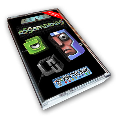 Remember Quartet, our flash game from 2010? Remember the Commodore64 port called Assembloids from late last year? After being an unexpected hit in the RGCD C64 Cartridge Challenge it is now available to buy on a C64 cartridge in both regular and deluxe editions from RGCD and also as a cassette tape from Psytronik.
I was excited to receive my deluxe copy in the mail today, and just as back in the golden days, the box comes full of goodies. Apart from the radioactive-green cartridge itself, there’s a neat little instruction booklet, a code-sheet for keeping track of your best scores, a sticker and a themed business card.
The game itself is further improved from the competition version, and features a multitude of neat little details.
Developing a game for C=64 has been immensely fun, in no small part thanks to having a great team of people. Enthusi (Dr. Martin Wendt) was constantly finding ways to squeeze even more stuff onto the cart and had endless patience for my (and others) requests and nagging.
It was a rare honour to have Conrad (Owen Crowley) employ his mastery of the legendary SID sound chip to provide a better-than-original rendition of my original Quartet MODs. Last but by no means least, Heavy Stylus (James Monkman) conceived and organised the whole effort and basically fathered the project.
Furthermore mad props to Jazzcat the trusty playtester and consultant who saved us from eternal shame on many an occasion. For me it’s always a blast making graphics on the C=64 as working around its limitations feels like a mix of doing pixel art and playing a puzzle game. Having to program a game from scratch meant re-balancing everything and the result is perhaps even more fine tuned to wreck your nerves just enough to still leave you wanting to have another go.
Here are some shots of the box contents (click for the high res version):
-
New RGCD Logo
31st Aug 2012
If somehow you’re not already familiar with RGCD, you should be. Now even cooler with a brand new logo by yours truly.
-
A year in Pixels and Paint (2007)
6th Dec 2011
A collection of 48 pieces of artwork created during 2007, spanning pixel, pencil and paintbrush styles.
Full gallery after the jump! Let us know your favourite in the comments 🙂
-
Soundbytes 10 Poster
2nd Nov 2011
If you’re into retro gaming, chances are you like chipmusic (or chiptunes) as well. For a couple of years now I’ve been pixelling posters for the Soundbytes chipmusic event series in Melbourne, but this is the first one I’ll actually be attending, yay! You can see all the posters in the series HERE.
Hire Us
All about Photon Storm and our
HTML5 game development services

Recent Posts

OurGames
Filter our Content
- ActionScript3
- Art
- Cool Links
- Demoscene
- Flash Game Dev Tips
- Game Development
- Gaming
- Geek Shopping
- HTML5
- In the Media
- Phaser
- Phaser 3
- Projects
Brain Food